
In fifth-century B.C., the theatre in Athens, Greece wasn’t just a form of entertainment, it was a civic institution and a serious competition.
At the annual state-sponsored Dionysia festival, three playwrights would each present a tetralogy of plays (three tragedies followed by a satyr play), in competition for first, second, and third place.
Like any game, there were rules to be followed, which Aristotle outlines in the Poetics, about what makes a good tragedy and what doesn’t.
But unlike many games, the winners were oftentimes those who knew which rules to break.
The rules—and rule-breakers—of Greek tragedy
The Poetics reads like a sort of instructional manual for building a tragedy. Aristotle describes the “rules of the game”: what the best tragedies all have in common.
Many of his “rules” are surprisingly strict to anyone who has been to a play in the last five hundred years or so.
Tragedy…must have six components, which give it its qualities—namely, plot, character, diction, thought, spectacle, and lyric poetry.1All quotations of Aristotle’s Poetics are from the Loeb Classical Library edition, translated by Stephen Halliwell.
tragedy tends so far as possible to stay within a single revolution of the sun
the poet must remember to avoid turning a tragedy into an epic structure (by “epic” I mean with a multiple plot)
And so on.
There doesn’t seem to be a whole lot of wiggle room in Aristotle’s rules, but he doesn’t reserve praise only for those who always maintained the status quo. He also tells how the playwright Aeschylus was the first to break some of the norms of Greek tragedy.
Before Aeschylus, tragedy looked a lot less like drama as we know it. There was only a single actor supported by a chorus. But Aeschylus added a second character and shifted focus to the actors and speeches, and away from the chorus and songs.2After Aeschylus, Sophocles went a step further, adding a third actor and scene painting.
According to Aristotle, we have Aeschylus to thank for creating a tragedy format that actually began to look something like what we know as theatre. So it’s easy to look at Aeschylus as a fearless innovator (which he probably was) and the rules of tragedy as useless, creativity-crushing restrictions.
But that’s not quite the whole story of rules in art.
All creators and artists work with rules, whether learnt from a teacher, imposed by a client, or created for oneself.
The trick is knowing when—and why—to break them.
A rule book for the accidental web designer
Right out of college I got a job as a copywriter, and somewhere along the way I began learning web design.
After four years of college, learning on the job was a really different experience.
Most of the time, when I was learning a new skill, it wasn’t to get the grade and file the skill away for later. It was so that I could fix a broken web page or finish a new site now—like right now.
In this sort of learning environment, rather than having a teacher tell you “this is the way things should be,” you begin to make rules for yourself, about what works and what doesn’t—both from a technical standpoint and a usability standpoint.
So, through a bit of trial-and-error, a lot of research, and a load of lessons learned from far more experienced designers, I began building a mental checklist of web design rules for myself:
A survival guide to UI design
01
Always make your menu prominent and easy to navigate. No one has time to get lost on your website.02
Use easily legible typefaces and a high-contrast color scheme. No one cares how pretty the font is if they can’t read it.03
Mobile web design is always the 800-pound-gorilla in the room. Do not forget to check the mobile layout.04
Don’t beat about the bush—tell the user who you are and what you’re all about ASAP.Rules like these helped me build better websites that not only looked good (if I do say so myself), but worked for the client and end-user. And it’s incredibly gratifying to be a part of creating something that’s both aesthetically and pragmatically effective.
But then something strange starter happening: over the years I began to feel the urge to break my own rules.
Maybe it was simply boredom, but I started wanting to make something without following all the rules.
It felt very counterintuitive, but eventually I realized that it’s nothing new at all.
Creators have been breaking rules since…probably about five minutes after they started making them.
That’s just as true in web design as it was in Greek theatre. And it turned out that there were plenty of people ahead of me who got bored with straight-forward web design.
Case in point: the Yale School of Architecture website.
At least they’ll never call it boring…
The first time I came across this site, it was on a list of “worst websites ever made.” The writer was astonished that an architecture school (of all places) should have such a hideous site—as if this were some sort of terrible oversight.
The type is stark, the color palette has the neon acid glow of the web-safe color spectrum, and the visual hierarchy has a “barely-there” quality to it. The eye is daunted and perplexed as to where to look first. And it actually takes some effort to break so many rules of design. This was no accident.
It actually takes some effort to break so many conventions of web design at once. This was no accident.
Actually, it is exemplary of a trend in web design, known as brutalism.
Brutalist web design
Brutalist website designs can be extravagant and minimalist all at the same time, visually jarring, and attention-grabbing—and not always in the most conventionally pleasing ways.
Many of these sites might remind you of that split-second glimpse you will occasionally get of a web page before its stylesheet is fully loaded—the page will look empty yet also chaotic, with default typefaces and a shocking disregard for visual hierarchy and negative space.
It’s like seeing a website in its bathrobe and hair curlers—only with a brutalist website, the page seems to never fully load.
And in truth, there is no more appropriate website design for the Yale School of Architecture.
The school is housed in a building which is an example of brutalist architecture—the original font of all brutalism. It turns out architects had gotten bored long before web designers.
Brutalist architecture
Brutalist architecture originated in the 1950s and ’60s and has a very utilitarian aesthetic, focusing on structure over ornamentation and showcasing raw materials, especially concrete. (The name “brutalism” comes from the French béton brut, meaning “raw concrete.”)
Brutalist buildings have a very polarizing effect. It’s hard to have a neutral opinion about them. They provoke the viewer to react, either with admiration or disgust.3I attended a university where I went to class every day in a building that had a distinct brutalist flavor to it (many universities seem to have at least one, sticking out like a sore thumb, among the more conventionally attractive collegiate Gothics). I hated it at first, but somehow over time began to really like it. I’m still not sure how exactly that happened.
 Sirius Building in Sydney, Australia, photo by Berenice Melis
 Thomas Fisher Library in San Diago, U.S., photo by Lianhao Qu
 Geisel Library in San Diego, U.S., photo by Victor Baro
 Geisel Library in San Diego, U.S., photo by Aris
 U.S. Holocaust Memorial Museum in Washington, D.C., photo by Yuvraj Singh
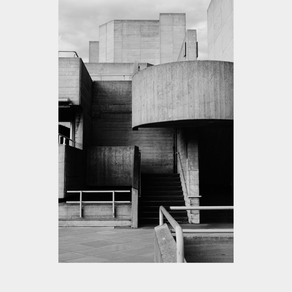 Royal National Theatre in London, U.K., photo by Mirko Nicholson
 Royal National Theatre in London, U.K., photo by Mirko Nicholson
 Barbican Estate in London, U.K., photo by Robert Bye
Brutalist websites have much the same effect—and it’s a very calculated effect.
You’re not obliged to like the YSOA website any better after learning that it was a conscious creation rather than an aberration of laziness (perhaps that only makes it worse). You don’t have to like it, but there’s no denying that the creators of brutalist architecture and web design have achieved something.
They’ve created an effect that you just couldn’t get by following the rules.
A choose-you-own-moral story
At this point, you may be attempting to distill a lesson from the story of brutalist design—either “This is why we have rules and conventions—to prevent aesthetic dumpster fires like this!” Or perhaps, “This is why we have to challenge the status quo—because rules crush true creativity!”
But I’m not interested in such lessons, because I don’t think the rules are nearly as important as the effect.
The question of whether to follow the rules or break them depends on the desired effect. Rules are tools in an artist’s hand—use them when they get the job done. If they don’t, make your own rules.
But having rules to start with—is everything. Break the rules, just know the rules you’re breaking—and why.
You may have noticed that for this website of mine I’ve not paid particular attention to all of my own rules.
I’m not throwing out the rule book, but I decided that my desired effect was something other than a traditional, straight-forward user experience. But I will let you decide what that desired effects is—and whether I have succeeded.